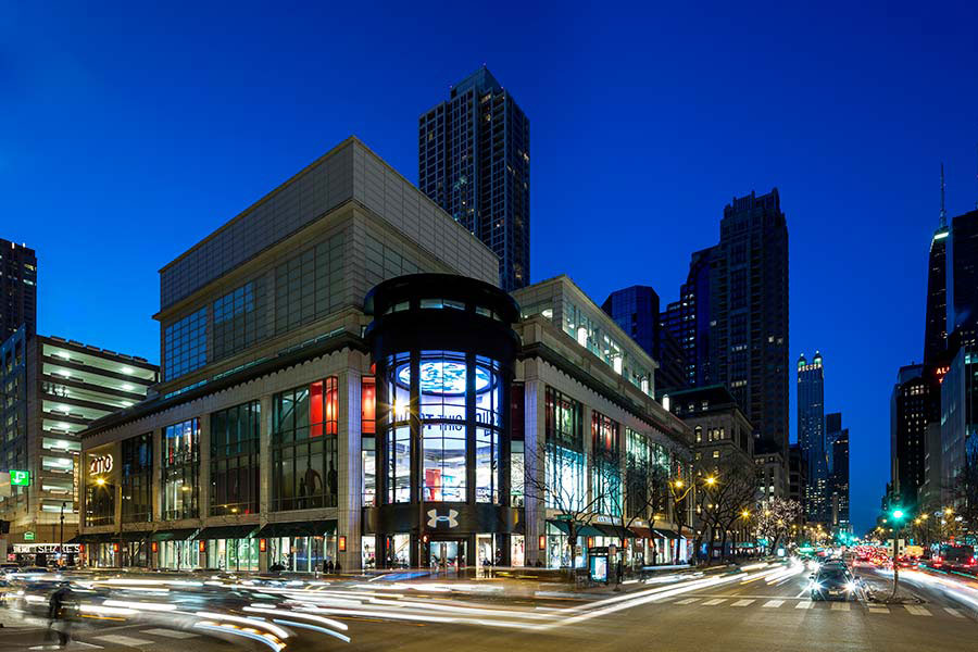
In another impressive flagship, captivating passersby in a major metropolis, Pure + Freeform’s aluminum plate, prefinished with Lumiflon wows. The storefront, on Chicago’s iconic Michigan Avenue, was Under Armour’s premiere in the Midwest.
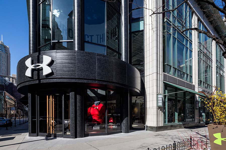
Wanting their debut to showcase their brand image, the designers at FRCH Design Worldwide mimicked Under Armour’s signature dark color palette, utilizing an aluminum material, which offered the exterior both a strong and modern appearance. The dark two-story building is a reflection of the brand, but also creates a beautiful contrast to the tan buildings juxtaposed on either side.

photograph courtesy of Retail Design Online
Under Armour, a brand of humble and fascinating beginnings, started in 1995. Its creator, Kevin Plank, noticed his university football teammates shirts, made of cotton, would get soaking wet while training. This prompted the student to invent a breathable lightweight shirt, impervious to heat and sweat. The now billion-dollar enterprise has a corporate image to match.

photograph courtesy of MG McGrath
The Pure + Freeform aluminum plate paneling was designed, engineered, fabricated and installed by MG McGrath for the 30,000 square foot flagship. The panels are prefinished with a Lumiflon FEVE fluoropolymer resin system that provides the exterior panels with exceptional protection from degradation both over time and climatic. According to MG McGarth, “A custom D-set panel system and pre-finished custom aluminum plate material for the finish…results were clean lines and need for exposed caulking during installation.”

photograph courtesy of Chicago Tribune
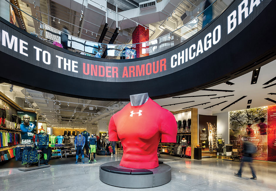
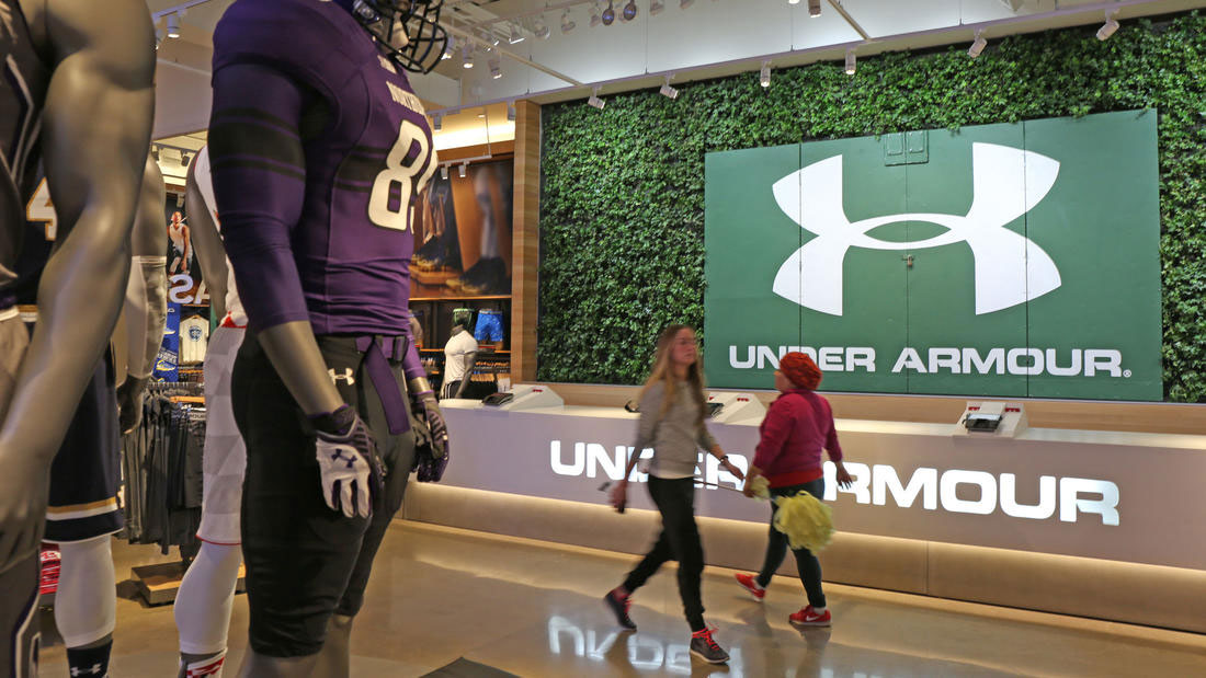
The black steel-like material used the exterior, with the use of concrete and wood, creates a timeless look for the powerhouse brand, whose identity was critical in their conceptual design. Dynamic displays, integrated lighting strategies, and interactive user-experiences allow the store to create a unique retail environment utilizing advanced technology and story telling.
As Tom Walsh, senior director of global store development for Under Armour tells Design Retail Online, ““We thought through every detail and experience to tell our story in our own words. We considered the journey and each moment as the customer works through the store. We wanted to use the space to hit on all of the senses and help inspire you to get better and achieve your goals.”
information courtesy of MG McGrath and Design Retail Online
photography credits under each photograph
