Color in architecture has been researched and analyzed to determine its effects on its inhabitants. Color evokes not only feelings such as excitement, serenity, or warmth, but can serve as an opportunity to capture attention in a heavily competitive marketplace. The influence of color is international, as we explore our most colorful facades around the globe.
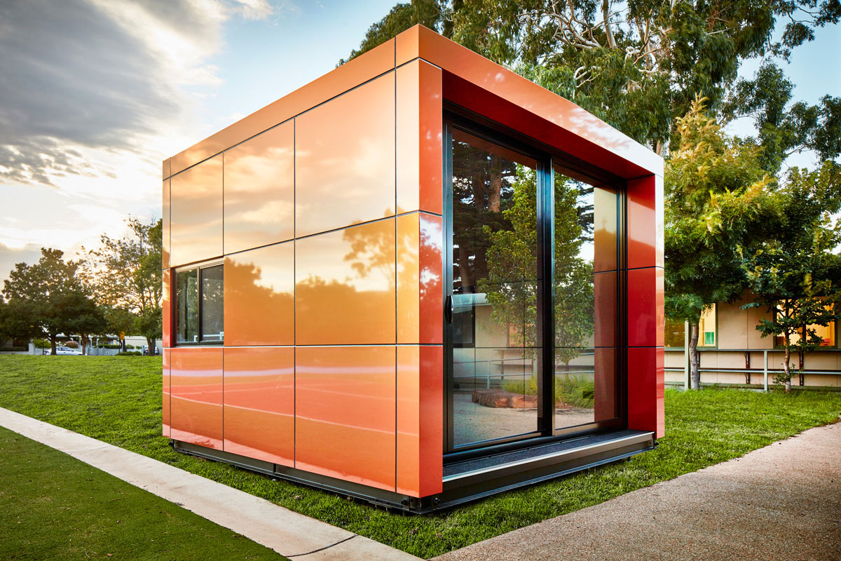
Number 5: Various Harwyn Office & Education Pods, Australia
©Harwyn Pods
Harwyn modular pods have revolutionized home office design to meet the demands of the competitive Australian housing market. The original pod was designed to create individualized, compact space for the at-home worker attempting to balance professional and home life. The designs are the collaborative efforts of founder, Jason Fremder, and Selwyn Blackstone.
©Harwyn Pods
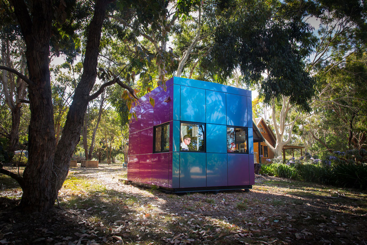
Originally creating personalized prefabricated home additions, Harwyn soon expanded beyond the home/creative studio model into different architectural markets. Previously examined, these modular pods have created modern spaces for the education market, who often rely on temporary structures when expanding. The pods were originally designed for single-person use, but have since developed a range of large, multi-story prefabricated designs.
The featured pods utilize ALUCOBOND®’s Spectra finish line is a color-changing ACM that contains a Lumiflon FEVE resin topcoat.
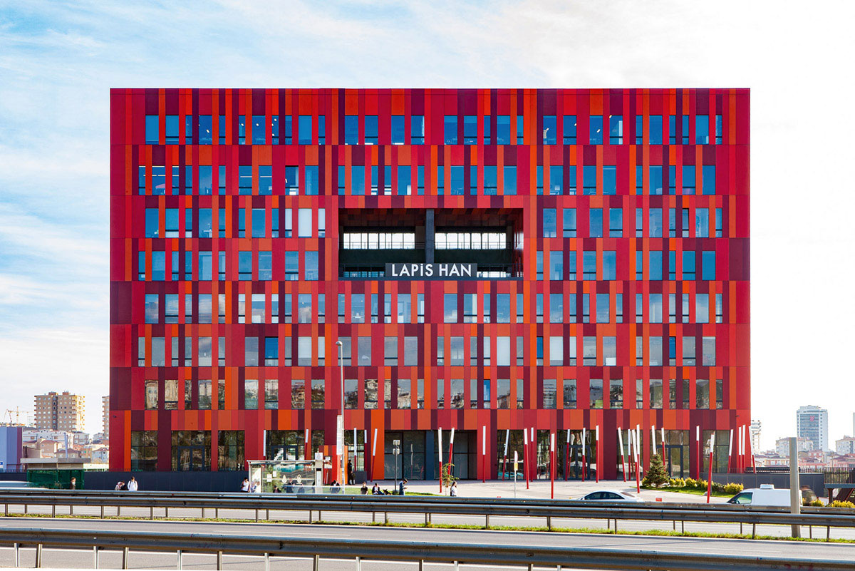
Number 4: The Gurallar Business Center in Kartal, Istanbul
Photography ©Studio Majo / Engin Gercek
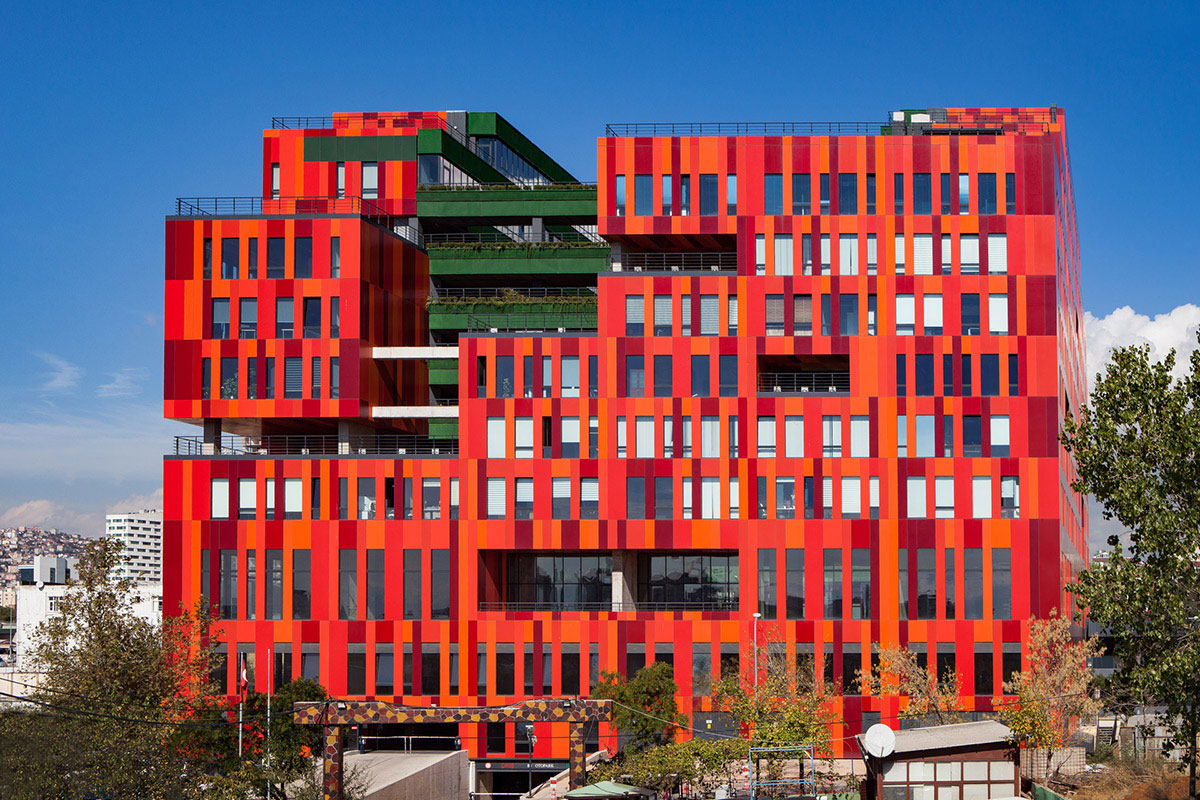
The Gurallar Business Center spans nearly 350,000 square feet and features a colorful, memorable façade. Often called “lego-like,” the unusual building stands out amongst the monolithic style of Kartal, Istanbul. To be noticeable from the highway, the architects designed the form of the building as a vibrant rectangular prism.
Photography ©Studio Majo / Engin Gercek
The colorful exterior was achieved with eight ALPOLIC® aluminum composite finishes. Featuring two cores, ALPOLIC®/fr and A2, the colors explore variations of red and orange. This fiery façade is further contrasted by the building’s centralized green courtyard. The exterior design ensures an iconic building, intriguing passersby and showcasing the modernity of Kartal.
Number 3: Small Roads Public School in NSW
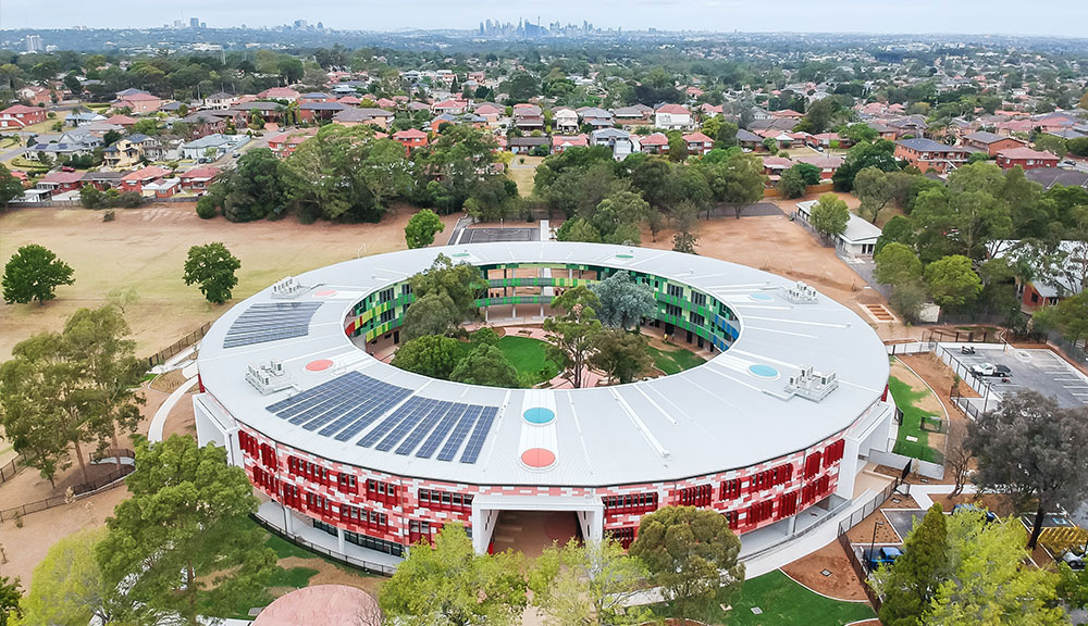
Photography ©NSW School Infrastructure
Reminiscent of an Apple facility, the architects designed the school in a distinctive circular orientation. Over three-stories, the building features a two-story library, 43 learning facilities, and three rooms for special education students. The school also features indoor and outdoor recreational spaces including a multipurpose sporting facility with sports courts and fencing.
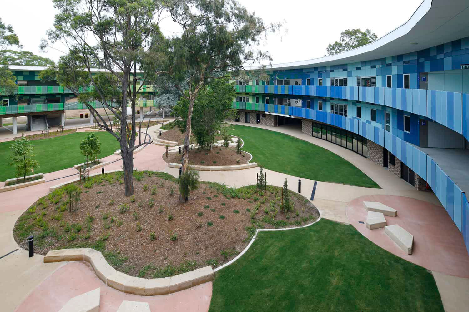
Photography ©Richard Crookes Constructions
The exterior is clad in Vitragroup’s Vitrapanel, a high-performance fiber cement cladding enhanced with A&I Coatings’ Vitreflon 700 fluoropolymer coating system. Vitreflon employs Lumiflon’s FEVE which offers architectural surfaces a plethora of benefits, all of which ultimately help maintain the structural integrity of the coating system.
Number 2: 565 Great Northern Way and Pavilion in Vancouver, Canada
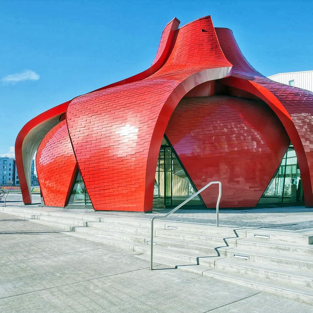
Photography ©Keith Panel Systems
565 Great Northern Way and Pavilion is a commercial and retail development by powerhouse architecture firm Perkins & Will in Vancouver, Canada. The project, adjacent to the Emily Carr University, features a seven-story office façade and one-story retail pavilion. The targeted LEED Gold pavilion balances the surrounding facades that are equally contemporary in design. While the pavilion stands out, specifically due to its orientation and bright red exterior, it interestingly does not detract from its surroundings.
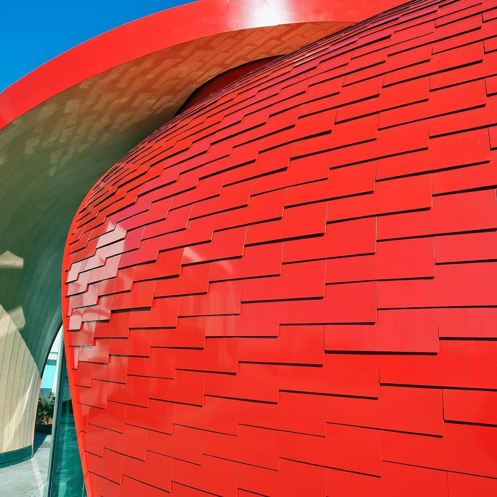
Photography ©Keith Panel Systems
Those overlapping shingles are composed of ALUCOBOND® PLUS Spectra Red tiles, custom fabricated by Keith Panel Systems. Emulating a flower, the unique tile composition offers an awe-inspiring exterior design. ALUCOBOND® PLUS Spectra panels feature a Lumiflon FEVE fluoropolymer resin topcoat.
Number 1: The Tarjeta Naranja in Córdoba, Argentina
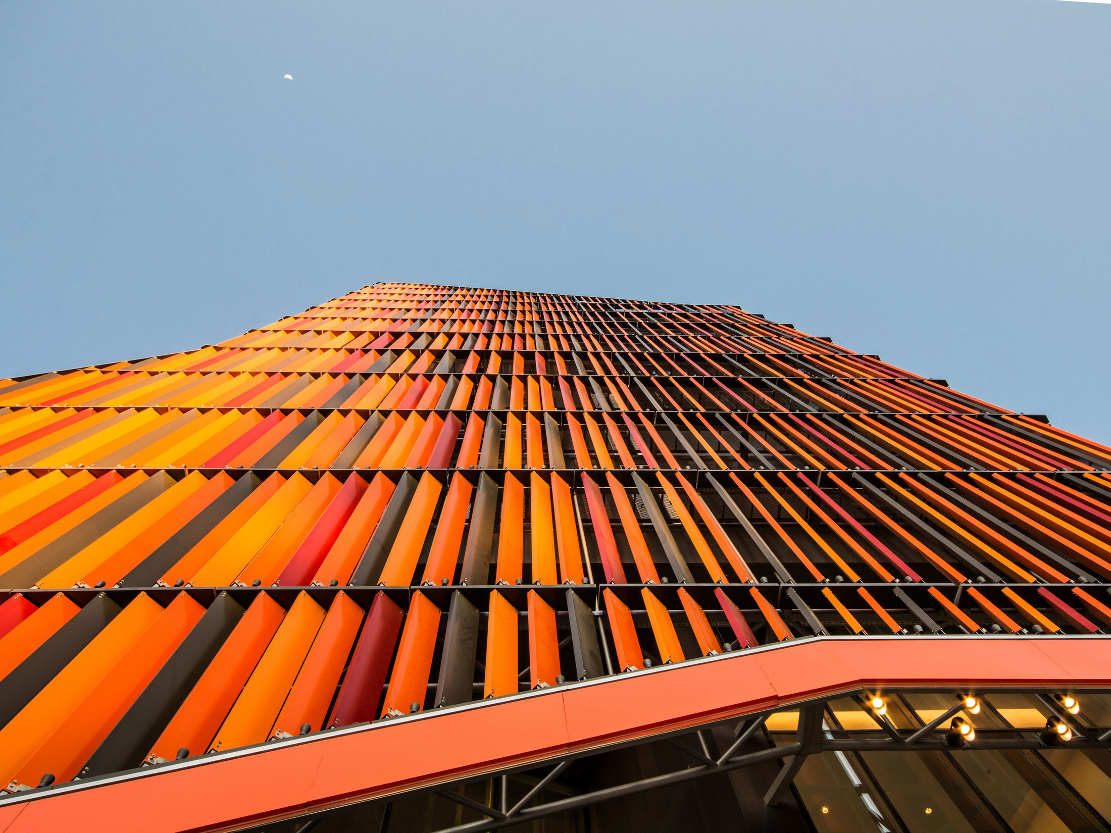
Photography ©Gonzalo Viramonte
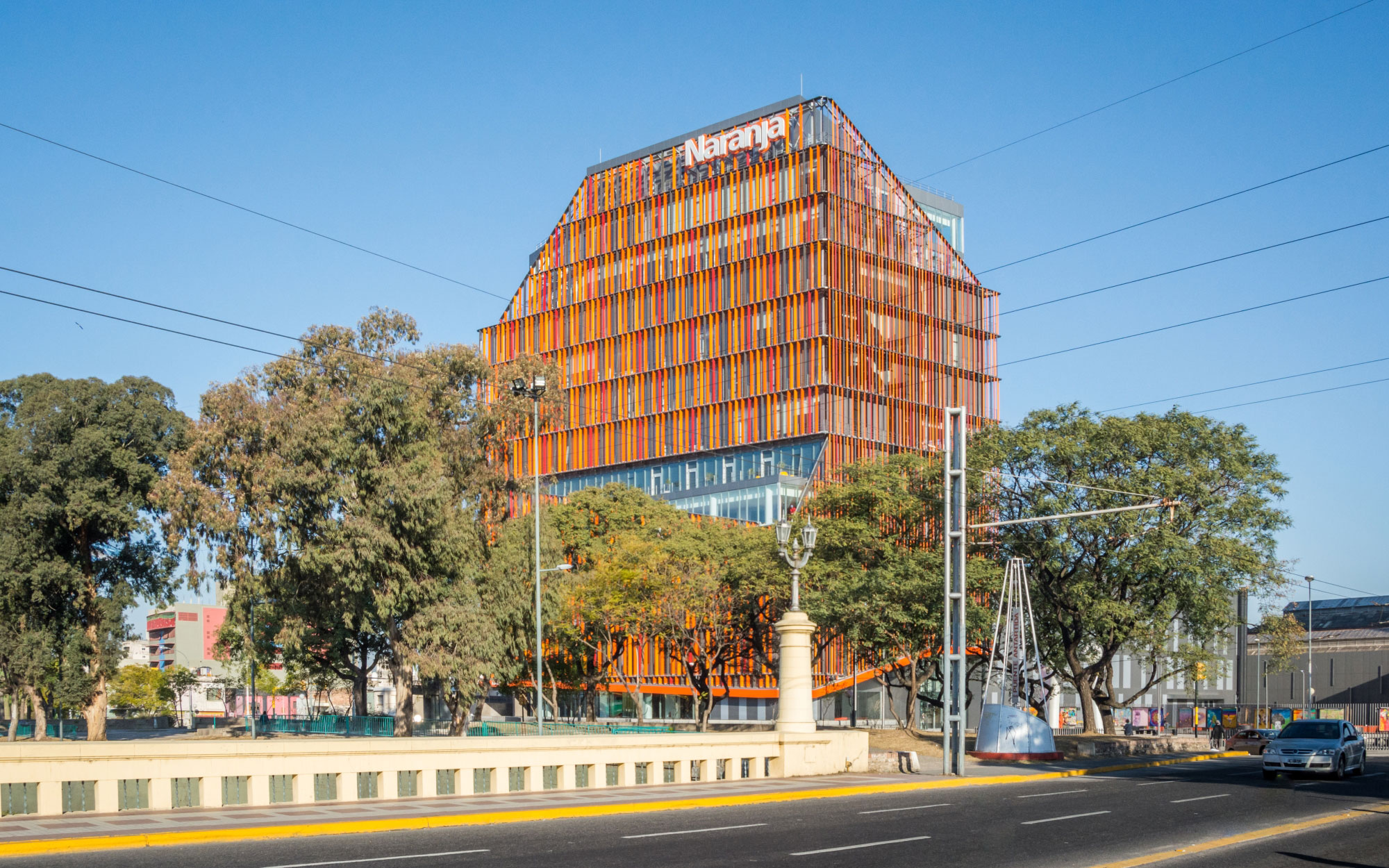
AFT Arquitectos designed the corporate headquarters for Tarjeta Naranja in Córdoba, Argentina. The corporate campus is composed of three buildings set over 100,000 square feet. The main building rises 12-stories high and achieved the first LEED certification in Córdoba.
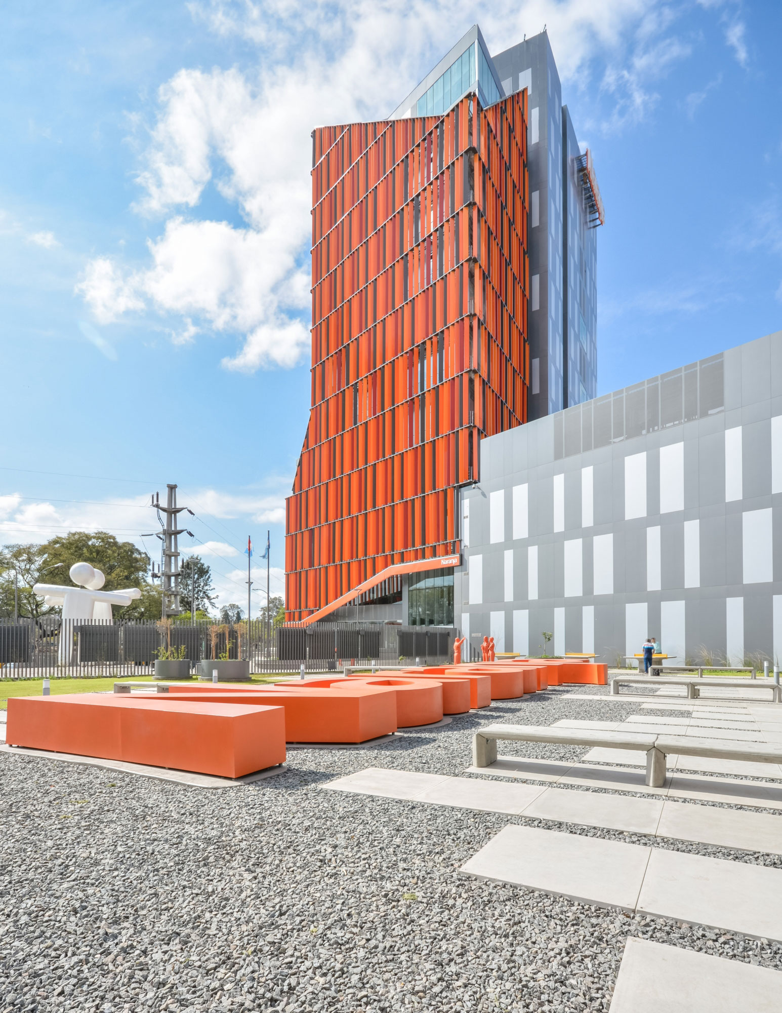
Photography ©Gonzalo Viramonte
The building’s façade embodies the Tarjeta Naranja company motto of “innovation, efficiency and joy” translated by the architects into an unmistakable orange design. As the editors at DesignBoom describe, “As well as adding a vibrant orange to the city’s skyline, at first glance, the building appears as a trapezoidal prism and depending on where it is being viewed, different angles have been achieved due to it being influenced by the internal programs.”
The solid color aluminum composite panels were fabricated by CGSA Argentina utilizing ALPOLIC/fr®. The ALPOLIC/fr® panels are enhanced with Lumiflon FEVE resin.
Photography ©see below each image
Categories Architecture